» Room With a View
November 6, 2017

Room with a View Quilt. Photo used with permission of American Patchwork & Quilting. ©2017
Have you seen the October issue of American Patchwork and Quilting magazine? They featured one of the latest Blue Underground Studios designs – the Room With a View quilt!
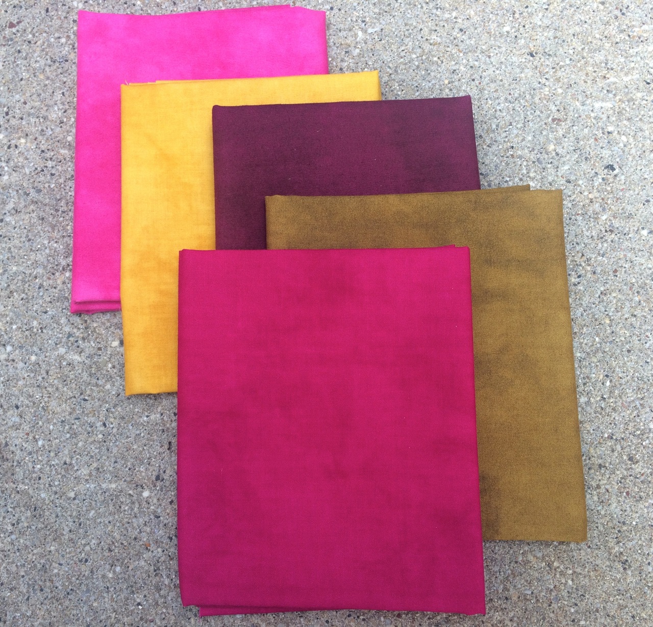
I love the colors in this quilt. Originally, I had selected a blue, green and earthy brown/gray palette. I wanted to make a quilt that would be suitable for guys and girls, and blue and green have long been a favorite color combination (green being my favorite color and all…). As I was sewing the blocks together, however, I realized that this quilted needed more spark. So I added the creamy white solid. And then started pulling out some warmer colors, starting with the gold tones to add to the squares. Gold, in this case a more subdued cousin of yellow, instantly warmed everything up. This is not a color that I work a lot with in quilts unless it happens to appear in a printed fabric that I fall in love with. But it is so rich, and can really act as a neutral on its own. I felt I was halfway there. I still wanted an addition that would be unexpected, sort of a maverick if you will. Since I started the quilt with blue as one of my anchor colors, I decided to go with fabrics that would offer high contrast. This is how the pinks and tomato red made the cut. Pink is not necessarily a color I would choose for a guy quilt, but I definitely think it works well here. Sort of like a really good looking man in a pink tie. It’s classic, and goes well with a dark suit :). After those two fabrics were chosen, the other ‘frame’ colors practically chose themselves – shades of violet, crimson, and even a coral.
This quilt is sparkling a little as I am looking at it on my kitchen chair. It’s partly the colors, and it’s partly the fabrics – the palette collection by Marcia Derse for Windham fabrics. If you’re not familiar with her amazing work, you can see it all here. The fabrics from the palette line are subtly textured and have a sophisticated look. I have been cutting kits for this quilt over the past couple of weeks (you can get one here!)…

and falling in the love with the color combos all over again. I’m definitely inspired to work with more gold. And I am very intrigued by the idea of using gold and pink together as a starter palette for a future quilt!