Crown Jewels
March 22, 2018
Well Begun is Half Done.
-Aristotle
(and Mary Poppins)
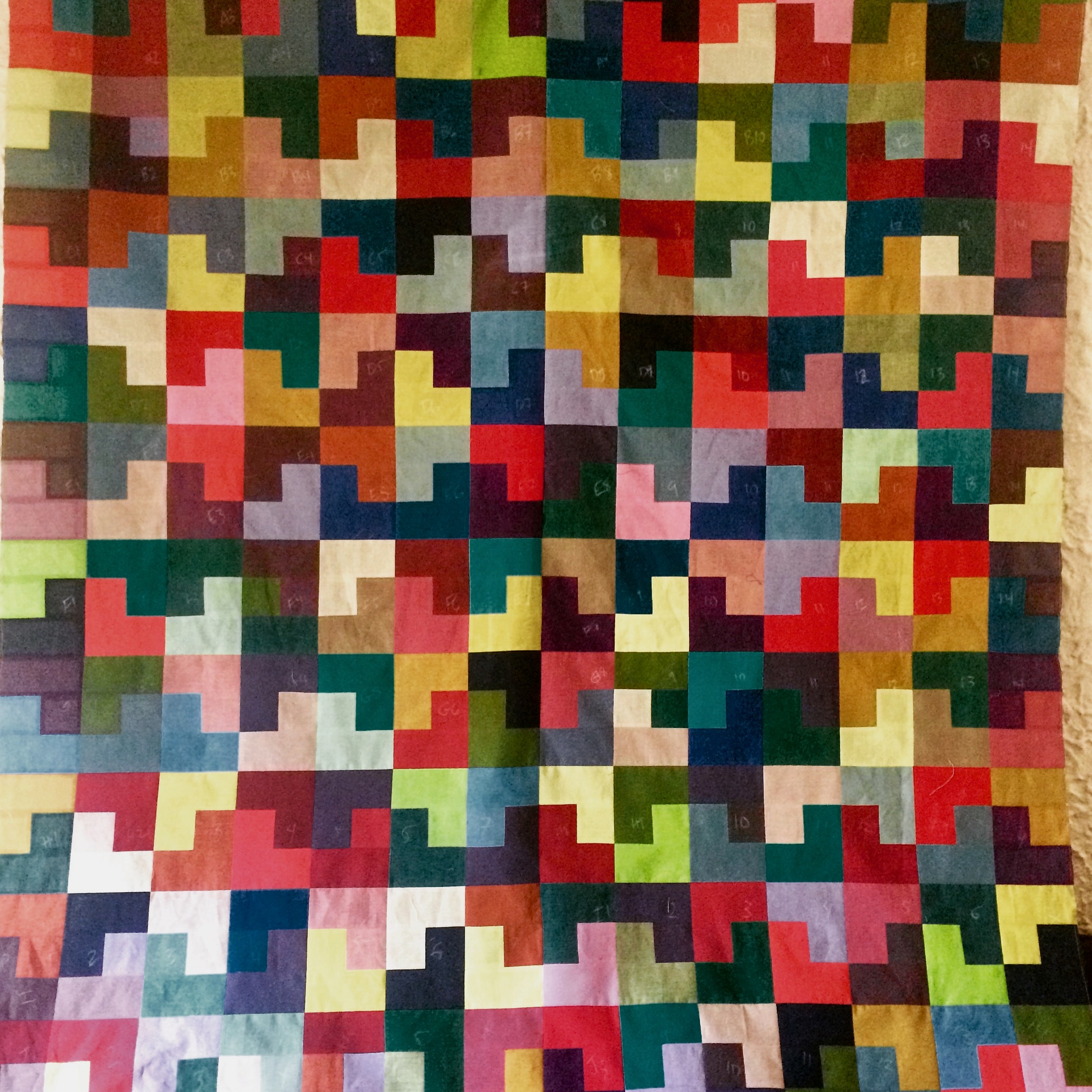
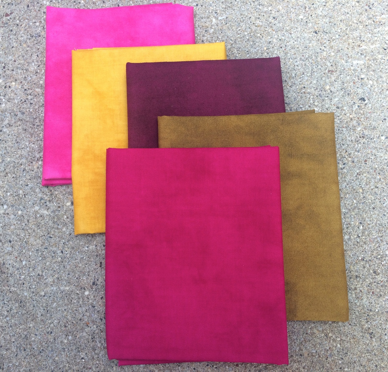
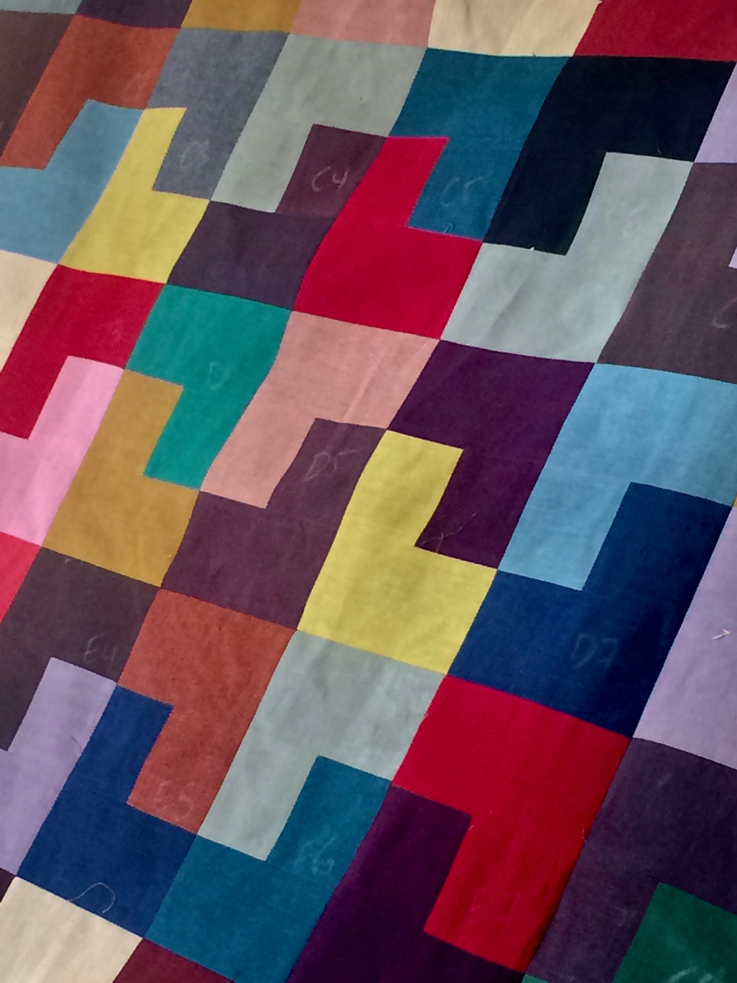
I finished a quilt top yesterday! It is a version of Crown Jewels using shot cottons in “jewel-like” tones. I made it slightly smaller than the original version thinking it might some day hang on a wall in my house. I also set it slightly different than the original quilt. I used an even number of block quarters, so there is the illusion of half a cross on either side of the quilt. I like the idea of customizing using subtle differences. Sometimes these differences are deliberate and happen immediately at the start of making a quilt. Other times they unfold as it is being sewn. In this case, the latter is definitely true! As I was sewing and laying out the blocks, aside from editing some of the colors out, I decided that some of the blocks I had sewn were not in color combinations that I liked. They, too, were edited out and I was left with a smaller number of blocks. Of course one can always say that design decisions are deliberate….who’s to know? At the moment, I have it pinned to the wallhanging above my couch so that I can live with it for a little bit and decide how to quilt it.
Working with shot cottons can be a little bit different than working with regular quilting cottons. The fabrics I used are specifically Westminster shot cottons, and I find them to be a little looser in weave that other fabrics. That means they can be prone to raveling a little and stretching when they are sewn and/or ironed. I love the look of them, though, so I don’t let that stop me from using them in my quilts. In the best of all possible ways, they have a worn look about them. Sort of like fabric with an old soul.
I like to use spray starch when sewing with shot cottons (just regular Niagra or whatever brand your grocery store carries is great) and always reduce my stitch length to 2.0 or just slightly larger. I also sew more slowly than I do normally. This may sound silly but frequently I put the pedal to the metal – so to speak- if I am excited about getting something done. Slowing down and sewing more deliberately results in seams that are more straight and even. It also reduces the possibility of the fabric stretching, and makes it less necessary for you to have to stretch your blocks to make them fit together in the end. I am not an expert of precision piecing by any means but I have found a few tips that make it harder to tell!
In addition, I usually sew this quilt together in quadrants rather than in rows. When I sew blocks together in rows they often ten to slant downward for some reason. I seem to be able to fix this by sewing quarters of the quilt together and then to each other. There are many methods of keeping track of your blocks as you sew them together. My favorite is chalk pencils. There’s too much going on in my house for methods other than marking each block with a number to work.
This sample is going in my “to be quilted pile” where it will wait along with the others – hopefully not for too long. I seem to be able to sew quilts faster than I can quilt them these days. Or maybe I just like piecing better than quilting. Either way, I never manage to zero out that pile!
Color Wheel
March 1, 2018
“All colors are friends of their neighbors and lovers of their opposites.”
-Marc Chagall

A couple of weekends ago I taught a color class at The Quilter’s Trunk in Chicago. I love teaching this class – first of all because I love getting out and meeting new people who love color, but also because I love talking about color and hearing what other people have to say about it! Invariably during class, we talk about the color wheel and its place in your arsenal where color is concerned.
Why I Quilt
February 14, 2018

Berkeley Blue Quilt in Red batiks (fabrics by Alison Glass)
Shortly after starting Blue Underground Studios I was giving a talk at a guild meeting and I asked the members why they liked to quilt. There were the various expected answers such as “I love fabric” or “I learned it from my mother.” But there was one woman in the group that evening – she was straight faced and looked very serious – who piped up after all of the others and said loudly “I quilt so I don’t kill people!” She said this without even cracking a smile and immediately everyone burst out laughing. It was a funny answer, to be sure. However, there was probably an element of truth there. Quilting (and all other creative pursuits for that matter) can save us in a sense….both individually and collectively.
LOFT quilt
February 13, 2018
I am finally working on a quilt that I started at the end of last year. It’s based on my LOFT pattern from our first book, Colorful Quilts for Fabric Lovers (C&T publishers). Late last summer I found out that this book was going to be available again as a print on demand version and I am so pleased! There were several patterns in this book that I love making. I decided that as time allows, I am going to make some of these patterns in some refreshed fabrics and palettes.
Room With a View
November 6, 2017

Room with a View Quilt. Photo used with permission of American Patchwork & Quilting. ©2017
Have you seen the October issue of American Patchwork and Quilting magazine? They featured one of the latest Blue Underground Studios designs – the Room With a View quilt!
I love the colors in this quilt. Originally, I had selected a blue, green and earthy brown/gray palette. I wanted to make a quilt that would be suitable for guys and girls, and blue and green have long been a favorite color combination (green being my favorite color and all…). As I was sewing the blocks together, however, I realized that this quilted needed more spark. So I added the creamy white solid. And then started pulling out some warmer colors, starting with the gold tones to add to the squares. Gold, in this case a more subdued cousin of yellow, instantly warmed everything up. This is not a color that I work a lot with in quilts unless it happens to appear in a printed fabric that I fall in love with. But it is so rich, and can really act as a neutral on its own. I felt I was halfway there. I still wanted an addition that would be unexpected, sort of a maverick if you will. Since I started the quilt with blue as one of my anchor colors, I decided to go with fabrics that would offer high contrast. This is how the pinks and tomato red made the cut. Pink is not necessarily a color I would choose for a guy quilt, but I definitely think it works well here. Sort of like a really good looking man in a pink tie. It’s classic, and goes well with a dark suit :). After those two fabrics were chosen, the other ‘frame’ colors practically chose themselves – shades of violet, crimson, and even a coral.
This quilt is sparkling a little as I am looking at it on my kitchen chair. It’s partly the colors, and it’s partly the fabrics – the palette collection by Marcia Derse for Windham fabrics. If you’re not familiar with her amazing work, you can see it all here. The fabrics from the palette line are subtly textured and have a sophisticated look. I have been cutting kits for this quilt over the past couple of weeks (you can get one here!)…

and falling in the love with the color combos all over again. I’m definitely inspired to work with more gold. And I am very intrigued by the idea of using gold and pink together as a starter palette for a future quilt!